Case study:
Multi product builder
As a UX/UI designer at Moteefe, I played a role in the rebuild of the platform, which involved conducting user research, designing key pages and implementing new features, resulting in significant improvements to the platform’s functionality and user experience.
UI/UX designer, User Research, Workshops, Usability Testing
4 weeks / fall 2022
Figma, Miro, Zoom

Introduction
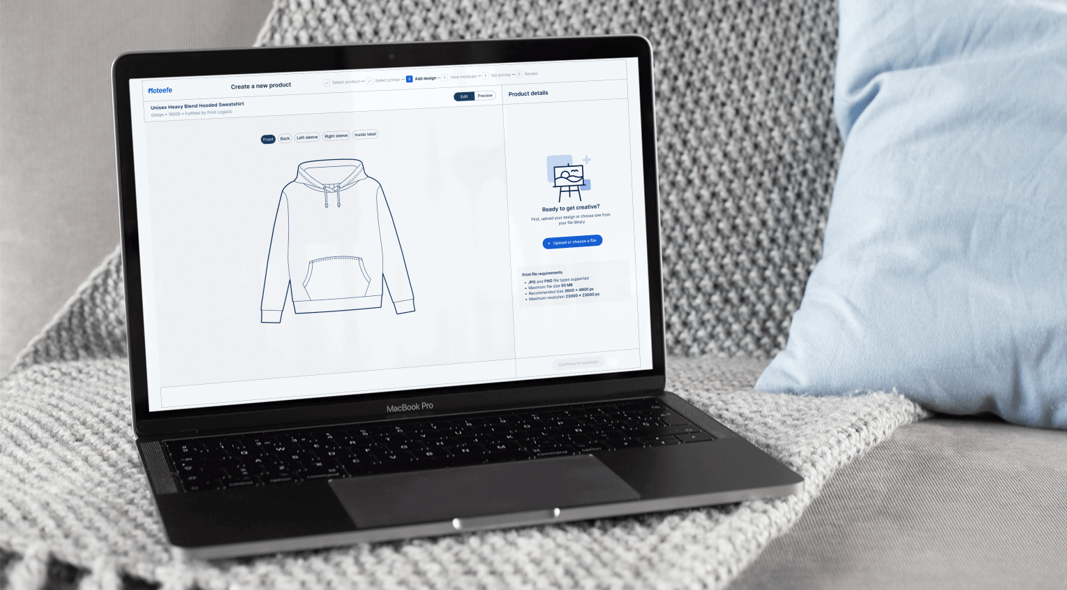
1. What is moteefe?
2. Context
Overview
I joined the team at Moteefe with the primary goal of working on a complete rebuild of the platform.
Despite its success during the pandemic, the company recognised the need to enhance and improve the platform to meet the evolving needs of our users and stay competitive in the industry.
I worked as a UX/UI designer alongside another UX designer, a graphic designer, the product manager, software developers, and stakeholders.
Challenge
My role
My responsibilities included designing key pages that were still in development as well as implementing new features to improve the overall user experience. I was also involved in research efforts to gain a deeper understanding of our users and learn more about the industry standards.
3. The project
This case study will focus on a feature called the multiple-product builder.
This feature aimed to improve the productivity of sellers on the platform by allowing them to create different products with the same artwork at the same time. This was not possible on the old platform, which was a problem for users as they felt like they wasted a lot of their time doing the same steps over and over.
4. Approach
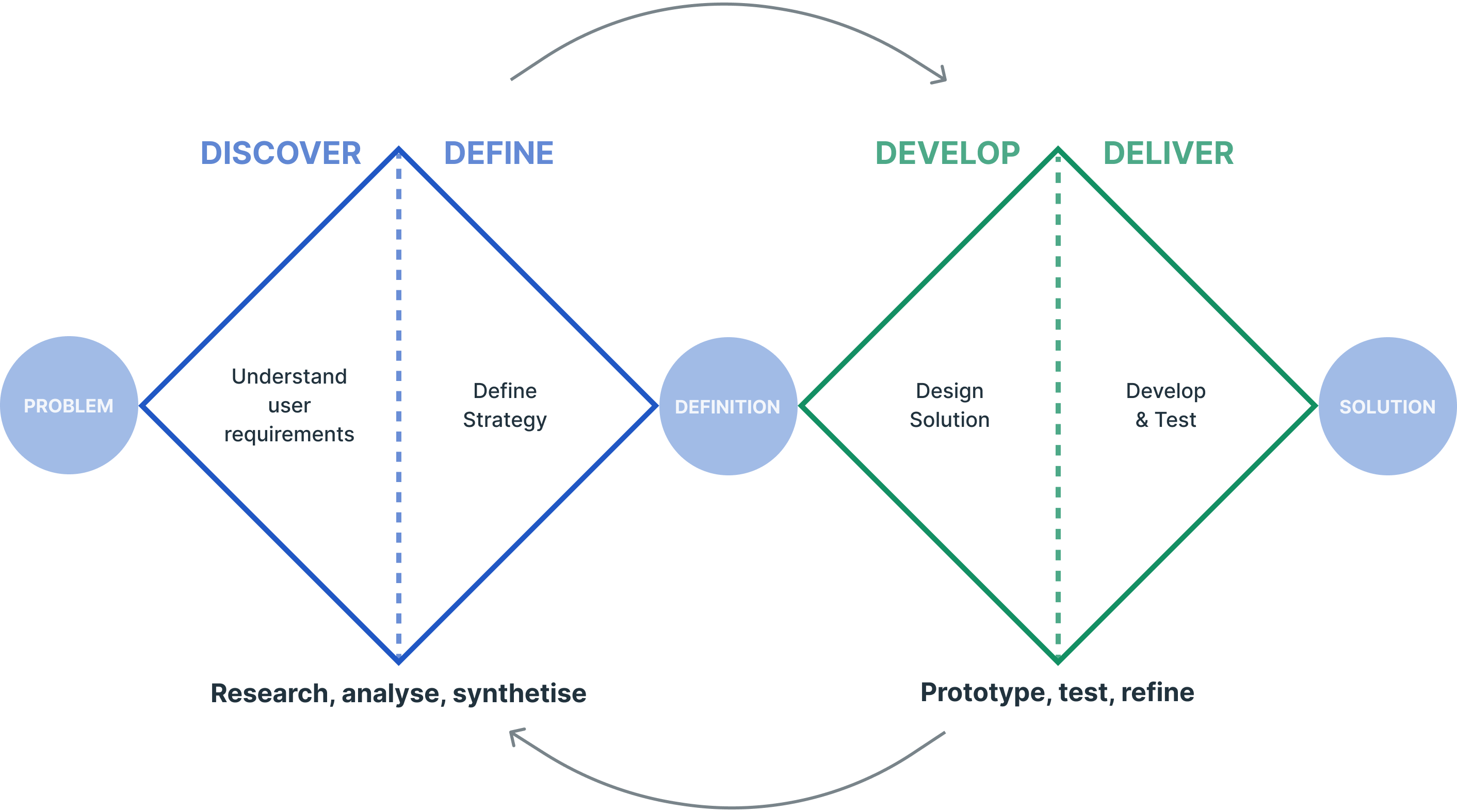
The project was tackled with the double diamond approach and the agile methodology.
The double diamond approach is a human-centered approach that focuses on understanding user needs using research and empathy, and the Agile methodology is a project management approach that emphasizes flexibility, collaboration, and rapid iteration.
When these two methods are combined, it creates a powerful framework for solving problems, developing new products, and improving existing ones.

Discover
1. User interviews
A) Introduction
User testing at moteefe
One of the most important things before starting to work on a new feature was to talk with our users. Moteefe regularly conducts tests and interviews with users to continuously improve the product by collecting long-term feedback and understanding their needs and motivations.
The idea for this new feature emerged after a series of interviews with our users.
Meet our users

B) The test
Objective and methodology
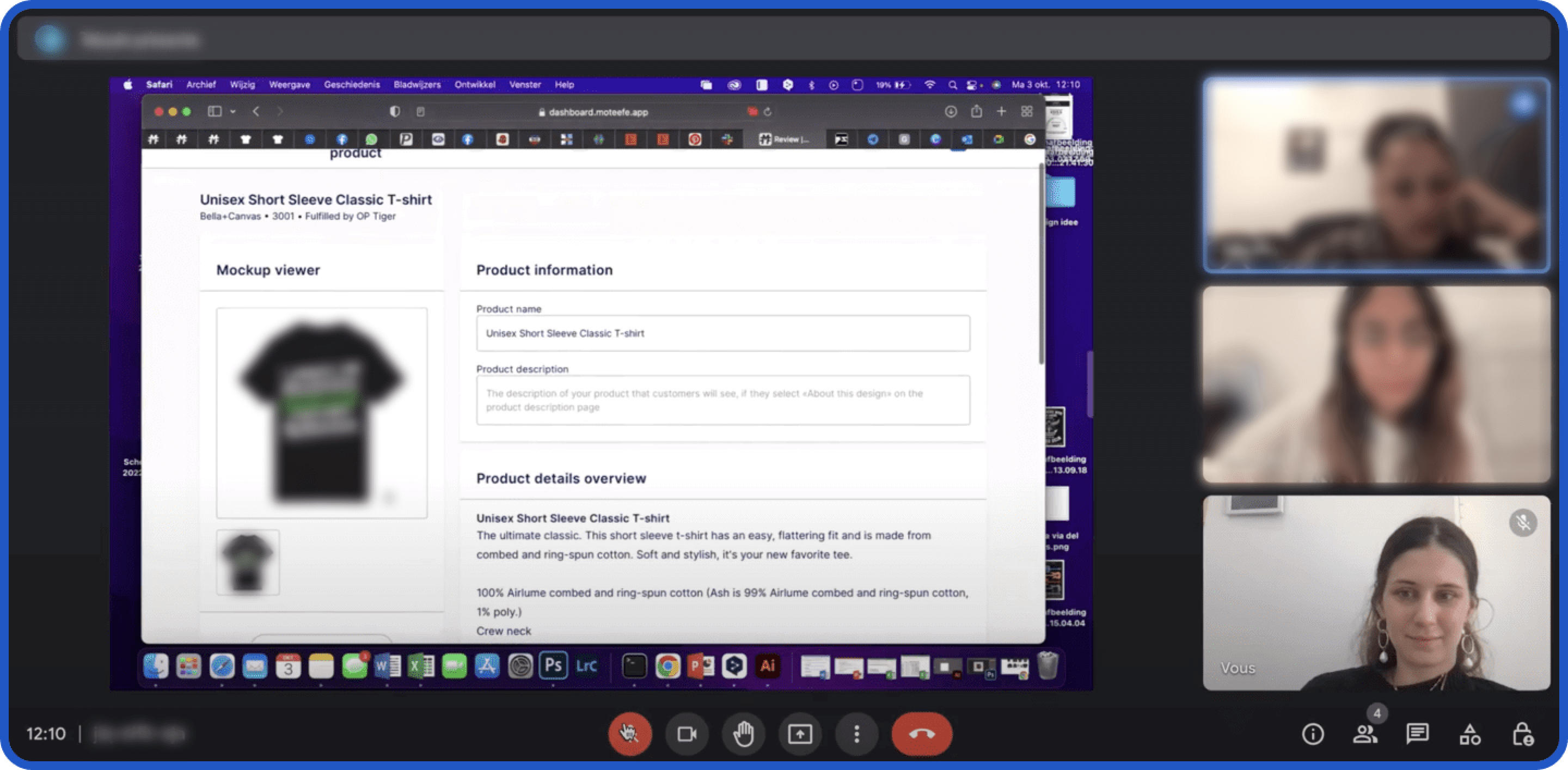
The purpose of this round of testing was to get feedback on the new platform. It this case, we asked them to go through the different steps of the product creation, which included choosing a product, adding an artwork, picking a printer, etc.
Conduct of the interviews
– Open-ended qualitative questions
– Observations of the user performing tasks
Logistics
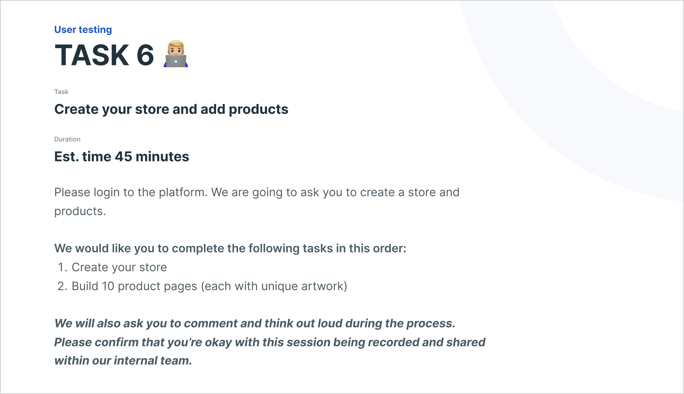
– 45 min to 1 hour interviews.
– Experienced users with a successful track record with the company
– Unpaid testers
C) RESULT
Some takeaways
- During testing, users found our product creation flow relatively simple
- However, they did encounter some pain points in specific aspects of the builder, such as understanding how to choose a printer or navigate the pricing screen
- Pain points: too many steps to create a product. Our users come to Moteefe to generate assets they can then market and the more quickly they can do this, the more time they can spend driving sales
- Users need to be able to duplicate an existing product and modify its design with minimal effort
- Users want to be able to quickly and efficiently create multiple products with the same design
2 types of action point
Our user testing yielded results that were separated into two categories of action points: Quick improvements on existing screen and new feature development.
1. Quick improvements
The first category were issues identified within existing screens. Those problems required low effort and could be quickly fixed.
Example: Printer selection
During testing, a user noted that the process of selecting a printer every time they create a new product was time-consuming and frustrating. They expressed a lack of enthusiasm for having to make this selection repeatedly.
Quote: “Can the printer be set for each country? It might only take 2 seconds, but 2 seconds is long when you have to create more than 100 products!”
Potential action points:
– Providing more guidance for printer selection, such as including all relevant factors in the printer listings (price, shipping times, quality, etc.) to assist users in making an informed decision
– Including a feature that allows users to save their preferred printer selection for future use.
Example: Progress bar
A user reported to us that they were frustrated during testing after reaching the review stage: He wanted to go back to make changes but lost all his customizations while doing so.
Cause: The progress bar is not working as expected. Progress doesn’t save, and users can’t go back to a previous step without losing all their work.
Potential action points:
– Improve progress bar logic and functionality.
– MVP: Implement a pop-up warning to inform users that progress will be lost when clicking on a previous step.
– Discuss with engineers the possibility of saving the progress of the user.

2. Implementation of a new feature
The second category is about identifying the need for new features.
This is a type of action that would require significant effort and involve a longer research and development process.
Example: The Multi-product builder

2. Competitive analysis
One of the other steps we worked on was a competitive analysis. To make sure that we would be making informed decisions, our team conducted extensive research on competitors to better understand how they handle the feature in question if they offer it.
Users flows
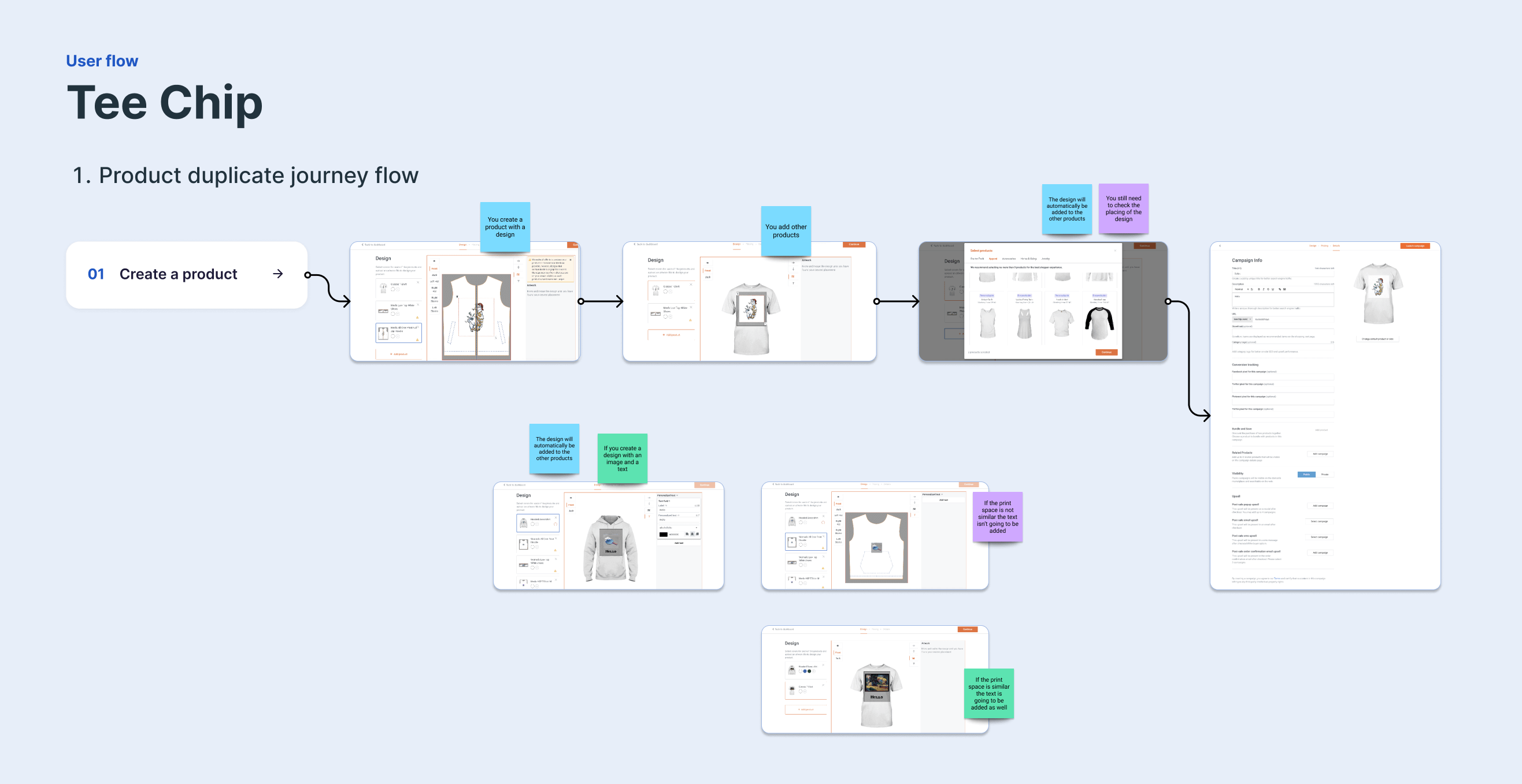
One of our tasks was to create a Miro board with our main competitors and map their user flows related to the creation of products and the functionalities we wanted to add (multi-product builder). Our goal was to note both the strengths and weaknesses of their approach, as well as gather ideas on how to create a competitive advantage.
In the image, you can see a quick example of one of the competitors, Teechip, with their product duplication flow.
3. Audit and identification of the limitations of our current flow
Current flow

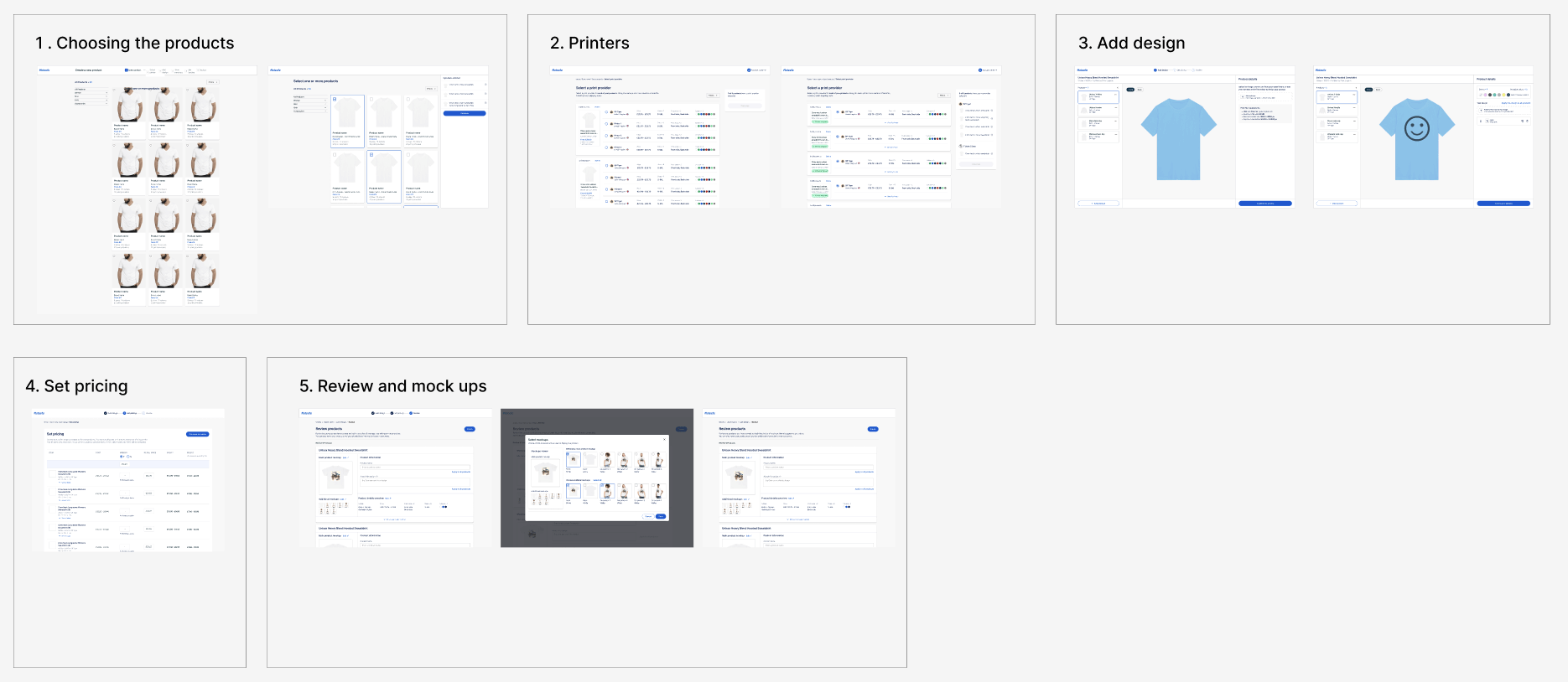
The current flow as it was was composed of 6 steps:
- Pick a product in the Moteefe catalogue
- Choosing a printer, which will take care of the printings and expedition of sold items
- Adding artwork to the product, which could be images, text or both
- Choosing the sizing that will be offered and fixing a price for each sizing
- Mockup creation page, to pick images of your product that will be shown on your product page
- Review page, where users can check that everything is correct before publishing their product
Audit
One of the tasks we wanted to work on was to review our current product creation flow and identify its limitations. To do this, we went through each step of the flow and added comments and possible improvements based on:
- Qualitative feedback from user interviews
- Design best practices and industry trends (to ensure that the design is up-to-date and in line with industry standards)
- Heuristic evaluation to identify usability issues
- Stakeholder contribution

4. Product management
Stakeholders workshop
Throughout the entire design process, the team followed an agile method with 2-week sprints. We held regular meetings and workshops to ensure that our work was well-organized and that we focused on the right tasks.
These meetings were used to determine the most important work to focus on, taking into account user interviews, business objectives, and the timeline. This approach helped us remain flexible and adopt an adaptive approach to project management, which allowed us to quickly react to evolving customer requirements and feedback.
These meetings typically consist of various tasks, with some examples including:
– Idea triage
– Roadmap backlog prioritization
– Agreeing on how to quantify effort between teams
– Checking requirements against user-centric goals
– Review of user feedback
– Validating requirements against business goals


Define
1. Defining the project objectives
Business case
Enhancing the productivity of merchants is a key objective for the platform, as it helps retain existing users and attract new ones.
Recent user testing has revealed that sellers would like to be able to apply a design to multiple products at once, which would help them build their stores more quickly. Currently, however, sellers cannot create multiple products using a single design within a single product builder flow. Consequently, they have to create products one by one, which is a time-consuming process.
Problem statement
Objective
2. Functionality requirements


Develop
1. Mapping out the user flow
The next step in the design development process was to map the user flows of the feature we were going to create.
The goal of this step was to get a full and thorough understanding of everything we need in the new feature to ensure a smooth user experience. This gave us a better understanding of how users would interact with the platform and achieve their goals and would help us ensure that the app would be intuitive and user-friendly.
Additionally, this process helped us formulate questions to ask developers to make sure everything was feasible to build and identify areas of confusion or uncertainty that we needed to clarify with users before going any further.

2. Low fi wireframes
With some user flows mapped out, I proceeded to create rough sketches of the app screens and began designing them as low-fidelity wireframes in Figma. This allowed me to quickly iterate solutions and make any necessary adjustments before moving on to the next phase of design development.
Example
One of the issue we faced with that step was that the different products were available from different printers. We didn’t know how to address that without creating confusion for users. To address this, I explored various solutions in low-fi wireframes that we could test without investing too much time in high-fi designs.
I came up with two possible solutions:
- In the first wireframe, when a user adds a new product, a modal window opens where they can select the product they want to add, and the products are sorted by printer. However, this solution would result in a lot of product, as each product would need to be duplicated for each printer.
- In the second wireframe, users first choose the products they want to add, and then assign a printer for each product in the next step of the modal.
We used these wireframes to gather feedback from users and stakeholders and determine which solution was the most intuitive and efficient. This way, we could improve the product builder’s usability and create a better user experience.


3. Refinement and iterations
After developing some more high-fidelity screens, we began the iteration process.
This was based on a feedback loop approach:
- We held sessions with stakeholders to gather their input
- Tested different possibilities with users
- Hold refinement sessions with other designers
- Confronted the screens to developers to ensure that everything we had designed was feasible to implement.
The goal of this process was to improve the design and ensure that the final design was user-centered and met the needs of the target audience. This process was iterative, meaning that it was repeated multiple times as the design was refined and improved.
Meeting with the development team
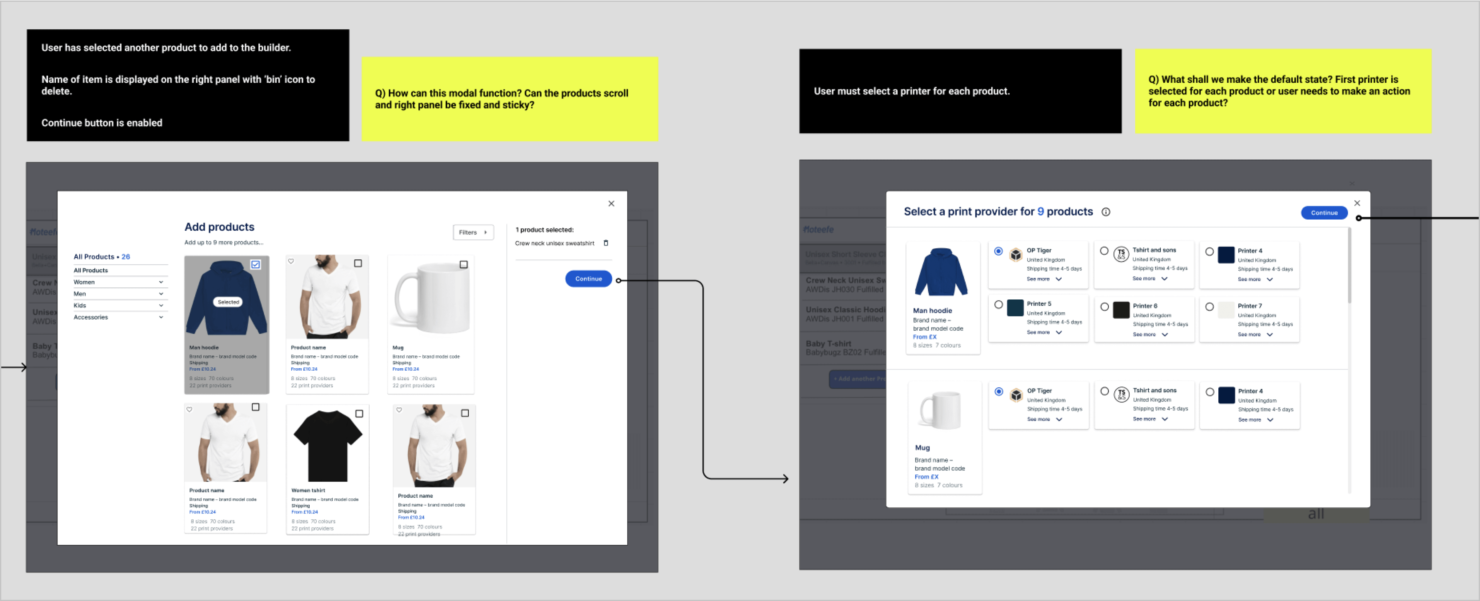
Example in the “Add additional products“ step of the builder:
- We’ve included detailed comments for each screen and explanations of the elements they can see, such as the absence of a selected printer and the disabled “Continue” button until all products are associated with one.
- We’ve added question for things we wanted to ask the development team or clarify with them.

Deliver
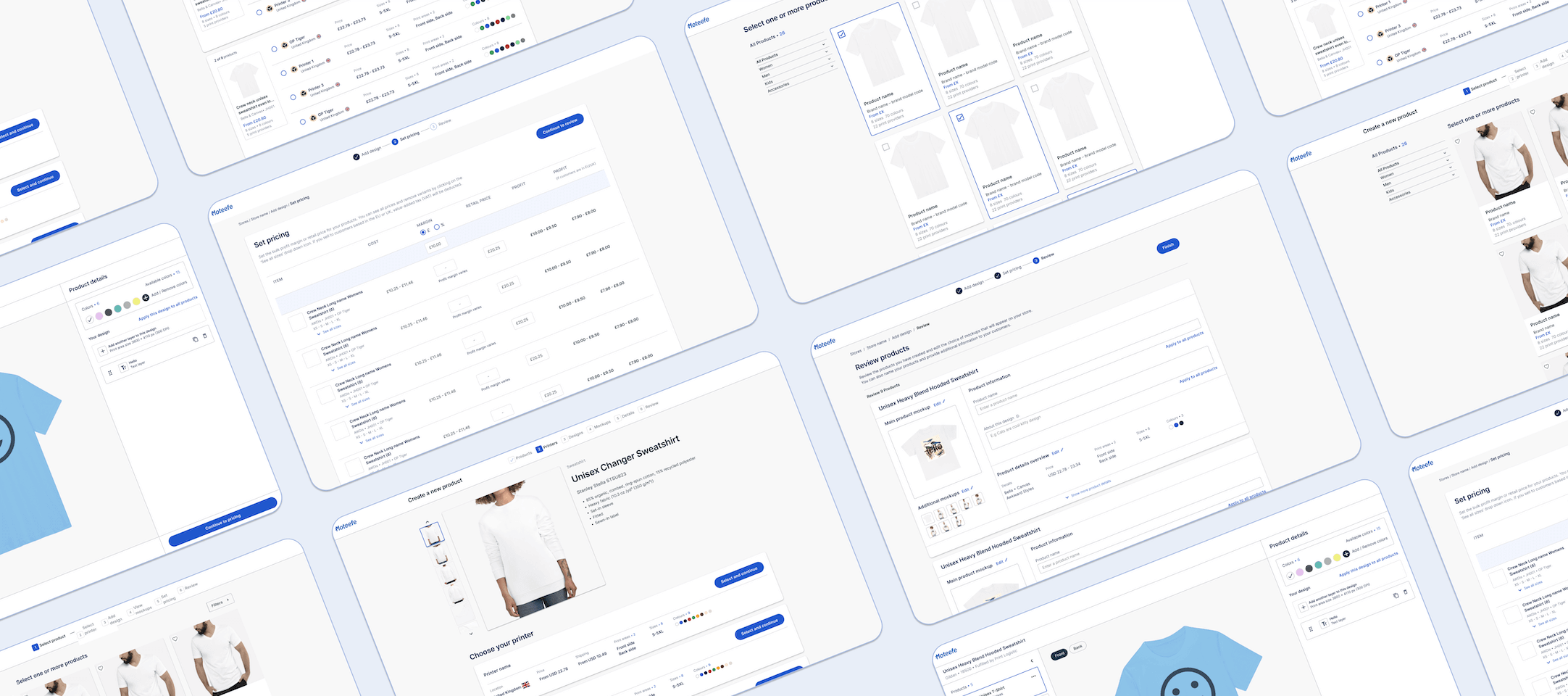
1. Final version
2. Design system
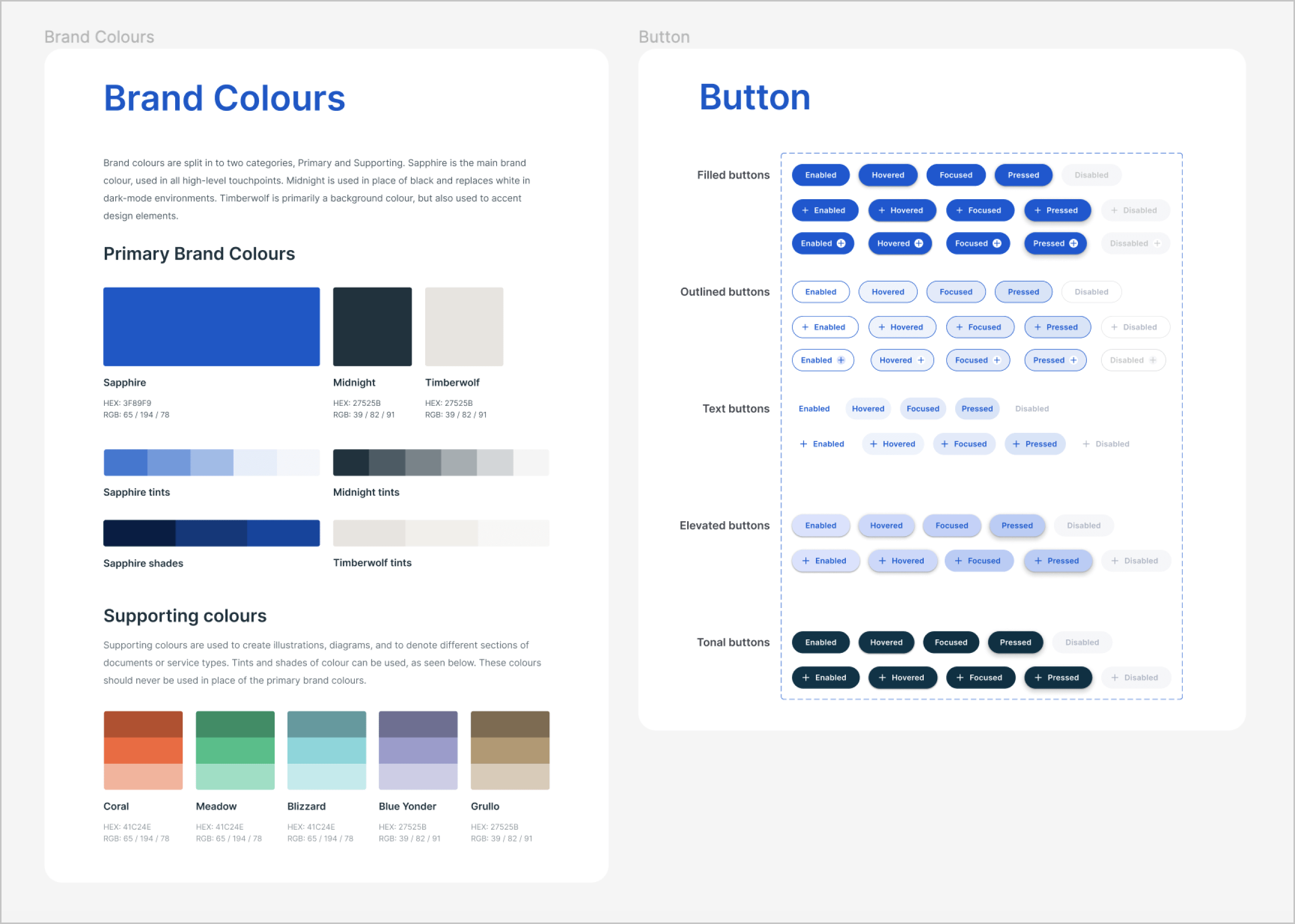
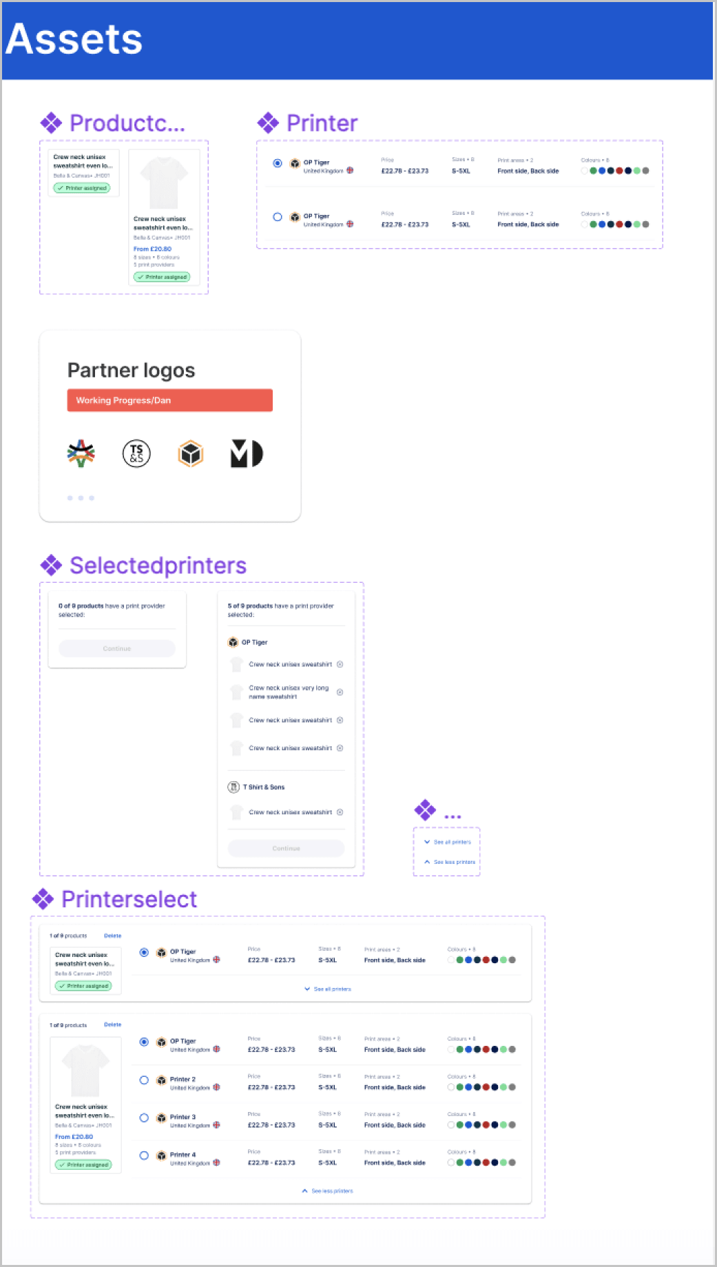
We used a design system that we had previously worked on in Figma to create the final wireframes. This design system, which we had developed and refined over time, provided us with a set of reusable components and established guidelines that we could use to consistently design and develop the app.
Goal
– Easier and consistent Design
– Simplified Development
3. Final flow


4. Before / After
Let’s discuss our progress in relation to the project requirements.
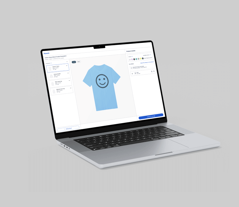
Users now have the ability to create multiple products simultaneously, resulting in improved productivity. By streamlining the process and reducing the number of steps required to complete the builder, we’ve made it more efficient and less time-consuming. We ensured that our solution is user-friendly through testing and iteration.
Key improvements
We believe that we have successfully implemented the new feature thanks to positive feedback from our users. The test results confirmed that our implementation effectively addressed user pain points and provided an easy-to-use experience.

Select multiple products at once
We started with a builder that only allowed you to create one product at a time and that was a very time-consuming process. Our new product build flow allows users to select several products at the same time, saving them time and efforts.

Automation of certain steps
We have automated certain steps, such as the pricing screen. Now it allows user to choose a price that is automatically set for all sizes based on their desired profit margin. This feature simplifies the pricing process and reduces the likelihood of errors.

Reduce the number of steps
We’ve combined the mock-up and review pages, allowing users to automatically choose all available mock-ups without having to create them one by one. They can still change the mock-up if they wish, but the process is much faster and more streamlined.
5. Some screens explained
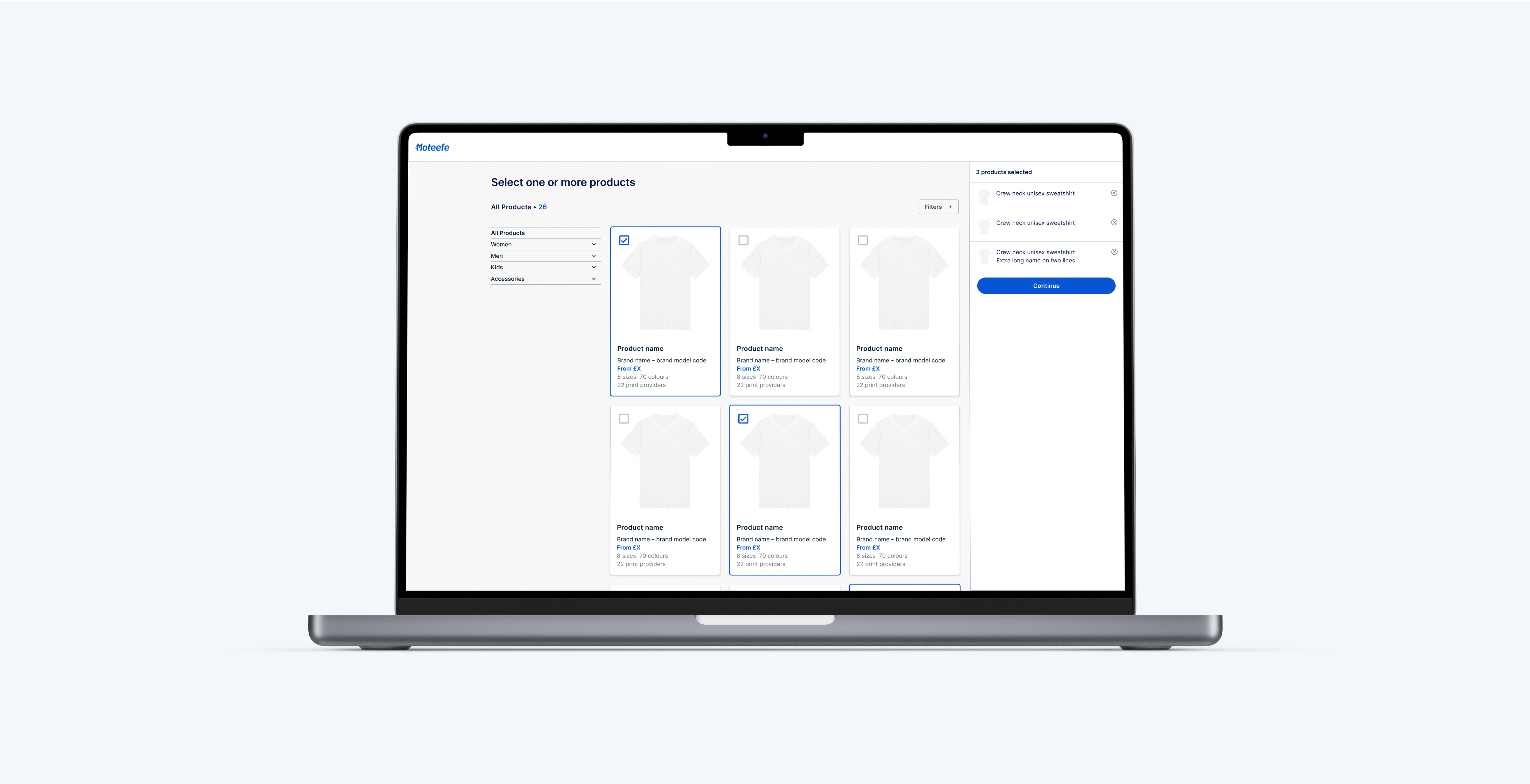
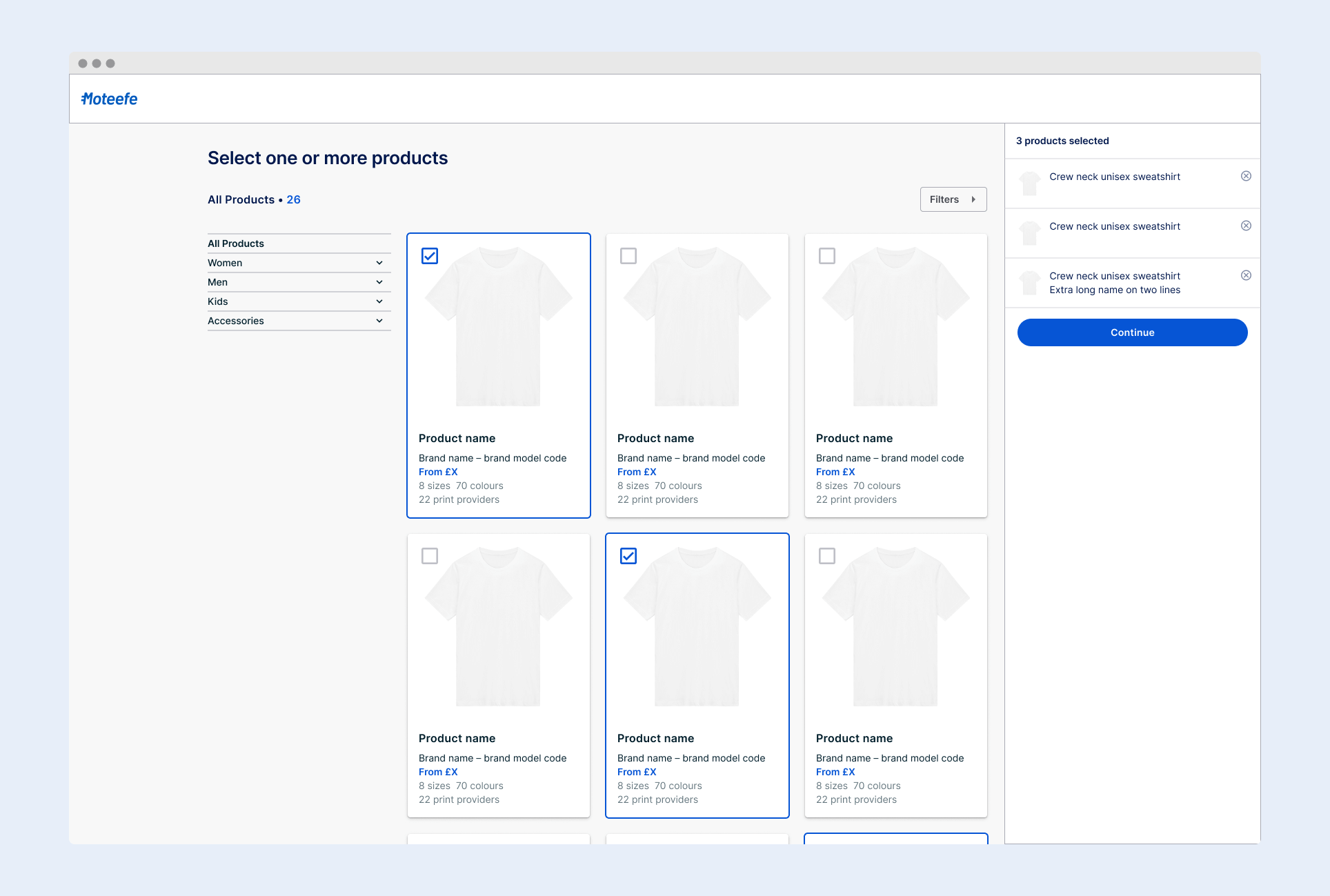
Products selection screen
– The user starts the flow by clicking on « Create a Product ».
– User has the possibility to select one product or to bulk select several products.
– Each product is displayed with an image, along with information such as price, sizes, and available colors.
– The left side of the screen allows users to filter products by category, making it easier to find what they’re looking for.
– On the right side, a summary of all selected products is displayed, allowing the user to easily review their selections before proceeding to the next builder step.
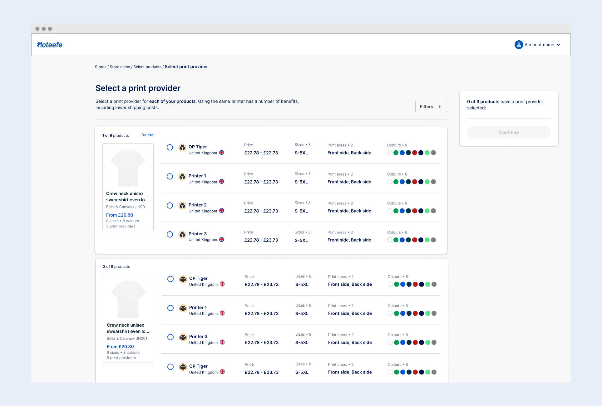
Printer selection screen
– After selecting multiple products, the user is prompted to choose a printer for each of them. He can filter available options using criteria (location, shipping time, and more).
– He also has access to printer cards with relevant information such as location, price, size and color options, and print area for each printer.
– A summary of their choices is displayed on the right, updating in real-time as they link products with print providers. Once they’ve made a selection for each product, they can proceed by clicking “Continue.”
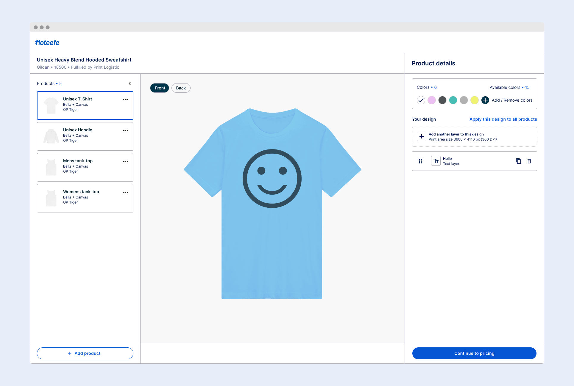
Design screen
– This screen allows the user to customize their products with designs.
– The interface includes a tab system on the left, displaying information about each product and providing options to delete, duplicate, or add more products via a drop-down menu.
– In the middle section, a mockup of the product is displayed, allowing the user to see their design on the product and switch between products using the tabs on the left.
– The right side of the screen features a « Details Panel » where the user can select colors for their product and add text or images as designs.
6. Handover
Transfer of our Figma project to the development team
We utilized a thorough handover process to transfer our Figma file to the development team to ensure a smooth and successful transition.
1. Comprehensive Handover Meeting
We started by holding a handover meeting with the development team, guiding them through the full flow and documentation, answering any questions and providing additional context where needed.
2. Detailed Figma File and Documentation
We gave them the well-organized Figma file with detailed information as well as, among other things, the design system and a range of necessary components. To ensure ease of understanding, all design elements and components within the file are organised and we provided detailed documentation outlining specifications such as spacing, typography, and color palettes.
3. Availability
Additionally, we made ourselves available for clarification or further questions during the development process.
The flow on the file
We created different versions of the flow to account for all possible states.
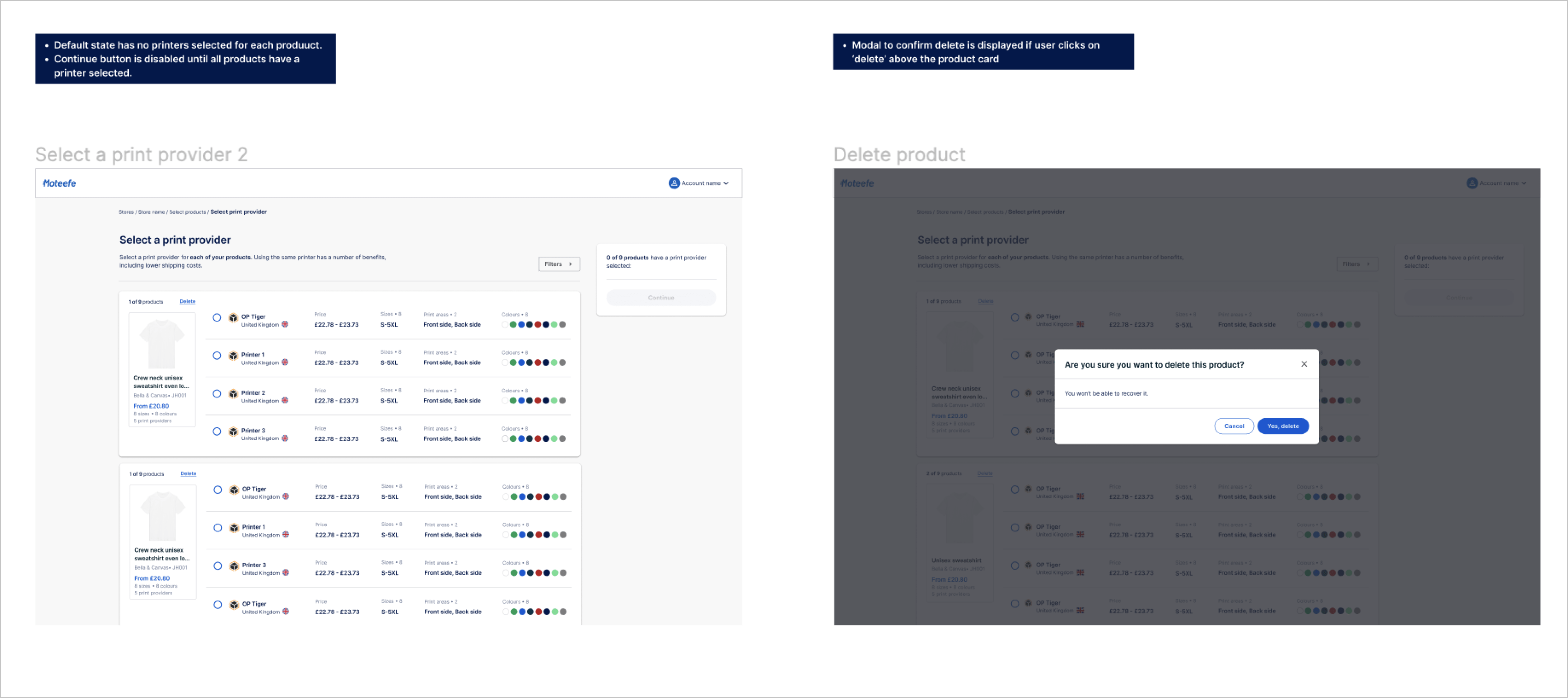
Example in the “Add a design” step of the builder:
- The option to collapse the tabs on the right to expand the mockup section in the middle
- The option to delete a product via the kebab menu and the product deletion modal
