UX/UI Case study
Kate Percy’s GO BITES
Role: Brand identity – Web & App design – UI/UX
Tool used: Figma, Illustrator
Table of contents
1. Design process
2. Website evaluation
3. Information infrastructure
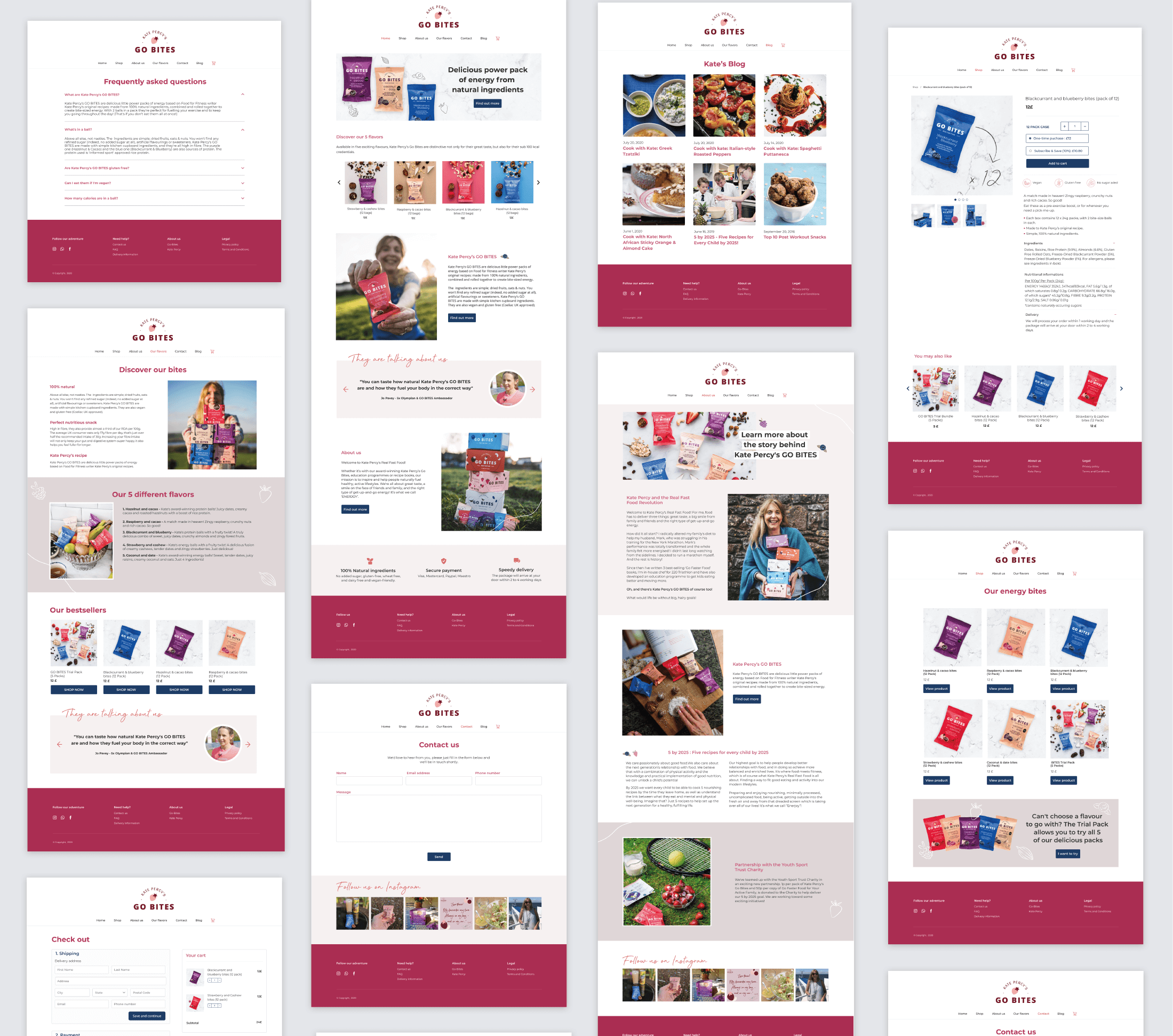
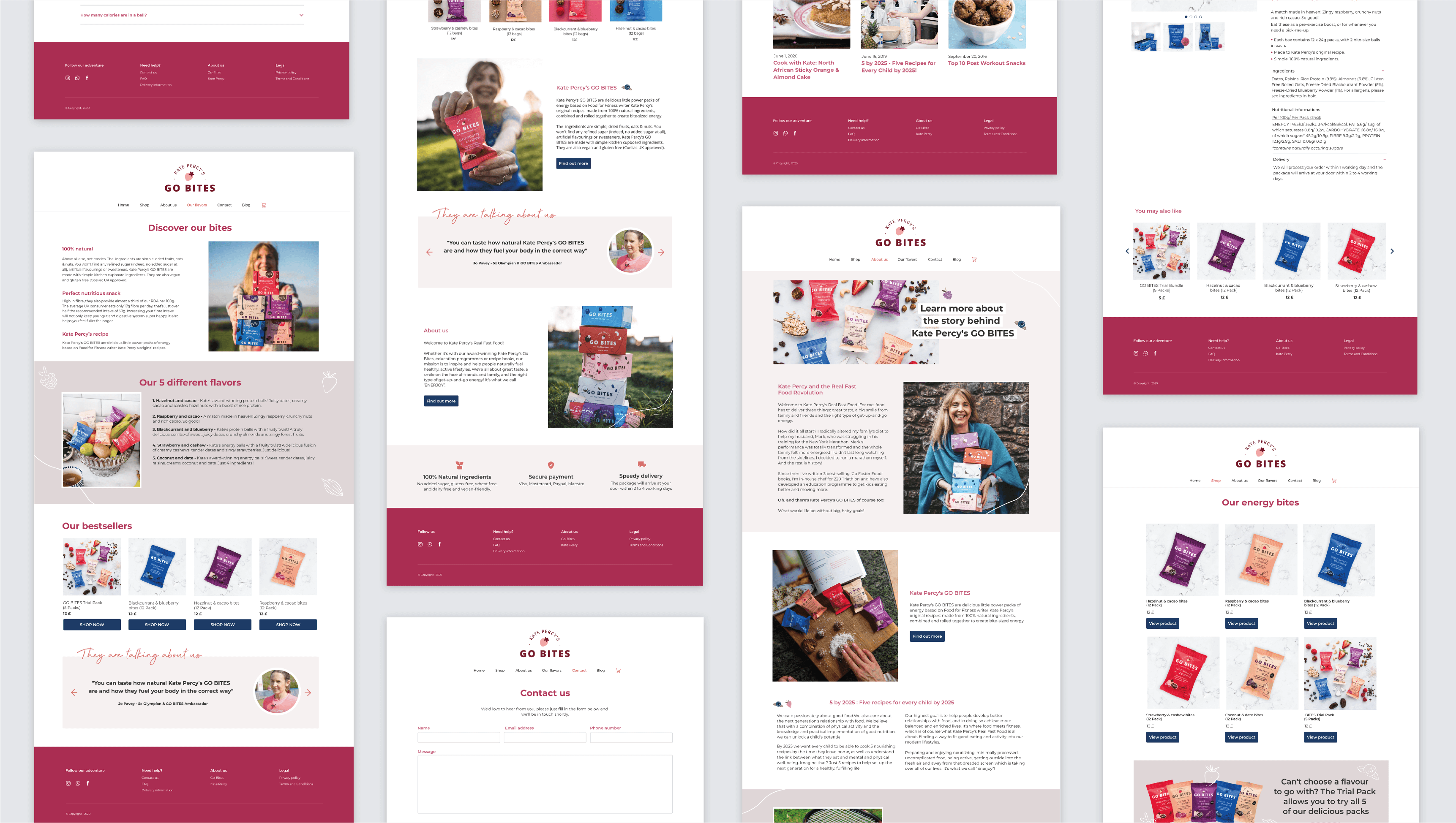
4. Design page by page
5. Next step for the brand
Design process

Design decision
How
– Understanding what works and what doesn’t works on the user in the current website.
– Make decisions backed up by an objective explanation.
Tools
– Established design heuristics
– Known principles
– Past experiences
Examples
– Jackob’s Law ![]() simplify the learning process for users by providing familiar design patterns.
simplify the learning process for users by providing familiar design patterns.
– A picture of someone smiling using the product ![]() increase conversions.
increase conversions.
Objectives
Primary
Redesign the website to increase sales
Secondary
Build brand awareness
Improve customer relationship![]() Repeat customers are 9x more likely to convert than a first-time shopper
Repeat customers are 9x more likely to convert than a first-time shopper

Website evaluation: Key discoveries
Is it easy for the customer to make a purchase? Or do they have to go through six different steps to find the product, add it to their cart, enter their payment information, and check out?
Website not optimised for e-commerce
– Can’t tell that it is an e-commerce at first glance
– No clear presentation of the products
– Shopping cart is hidden
– No prices
– No content hierarchy
– No clear flow toward shop
Hard to navigate
– Menu hard to find (hamburger menu)
– No about page
– Confusing label names in the menu
– Too many choices in the menu
– Design bulky
Strategy
– Simple modern design
– Showcase products and benefits
– Highlight trust signals
– Clear content organisation
– Intuitive navigation: easy to use
– Smooth shopping experience
– Efficient checkout process

Information architecture
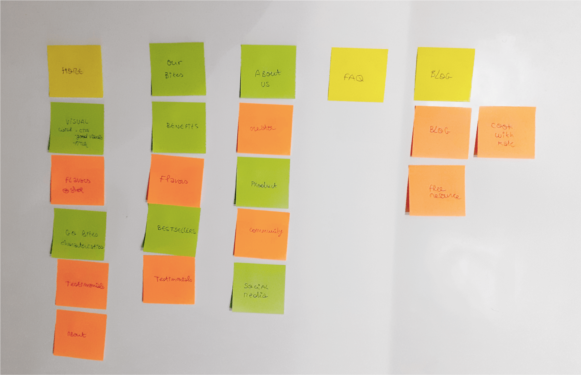
Illogical content structure and poor navigation can lead to a bad user experience.
I created sticky notes for all the content already present on the website and layed everything on a whiteboard.
The goal was :
1. To create a clear menu and forming a better understanding of design goals
2. To reorganise information:
By eliminating unnecessary pages, removing duplicate content, adding new essential contents and organising everything in the best way possible for the users.
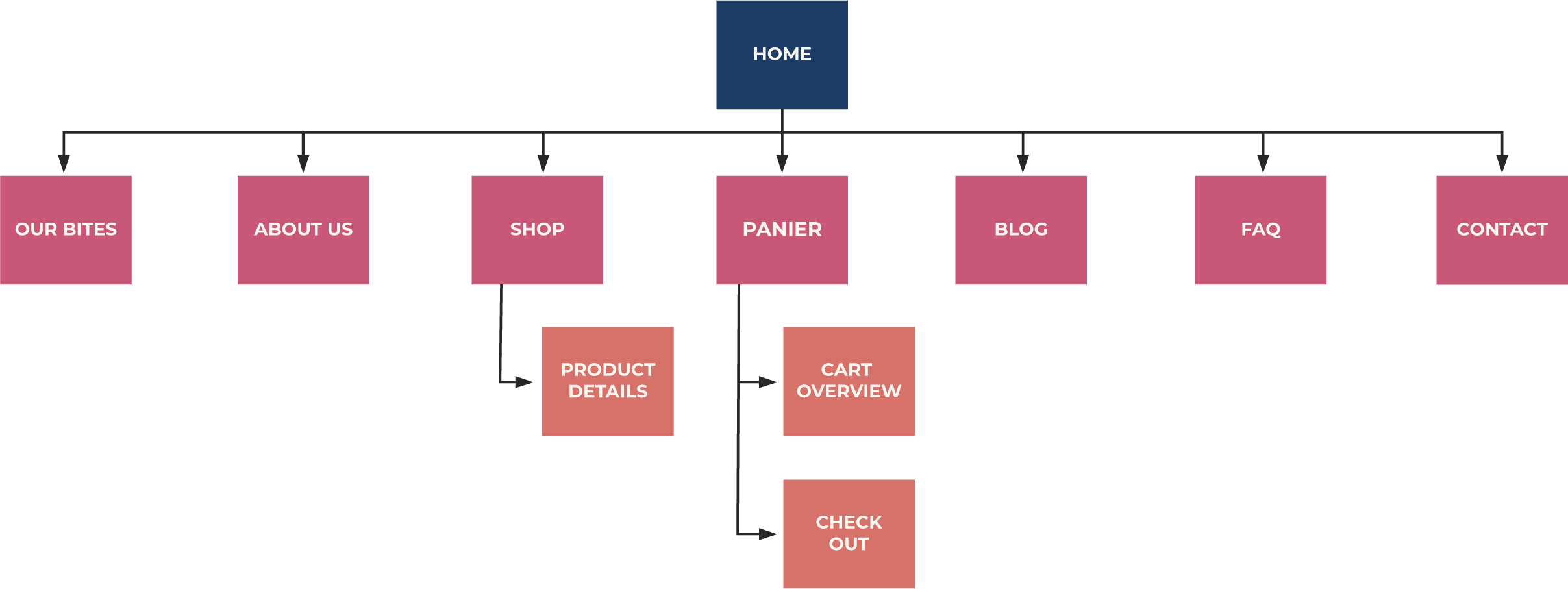
Site map
I created a site map to define the overall structure of the website.
Menu
Before
BUY KATE PERCY’S GO BITES
BUY RECIPE BOOK
KATE’S BLOG
COOK WITH KATE
CONTACT US
FREE RESSOURCE
5 BY 2025 MISSION
After
HOME
SHOP
CONTACT
ABOUT US
BLOG
OUR FLAVORS
Before

After

Sketches
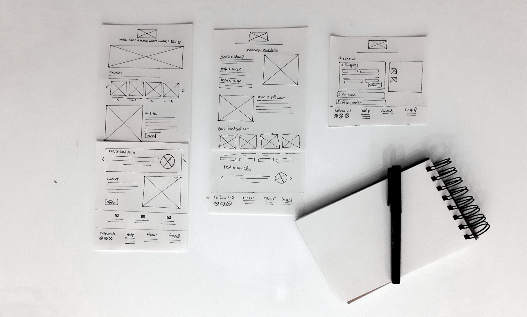
I started with sketches for the first stage of the interface design. Sketches are a great way to test a lot of concepts and quickly iterate.
Wireframes

Hi-fi prototypes

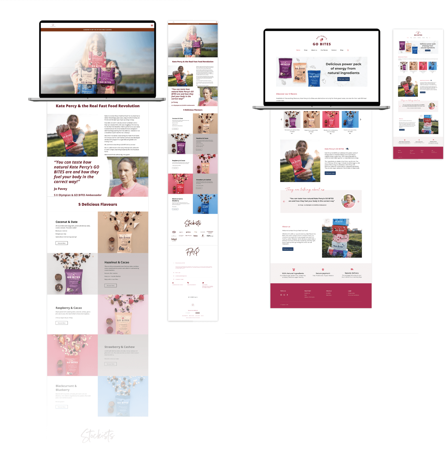
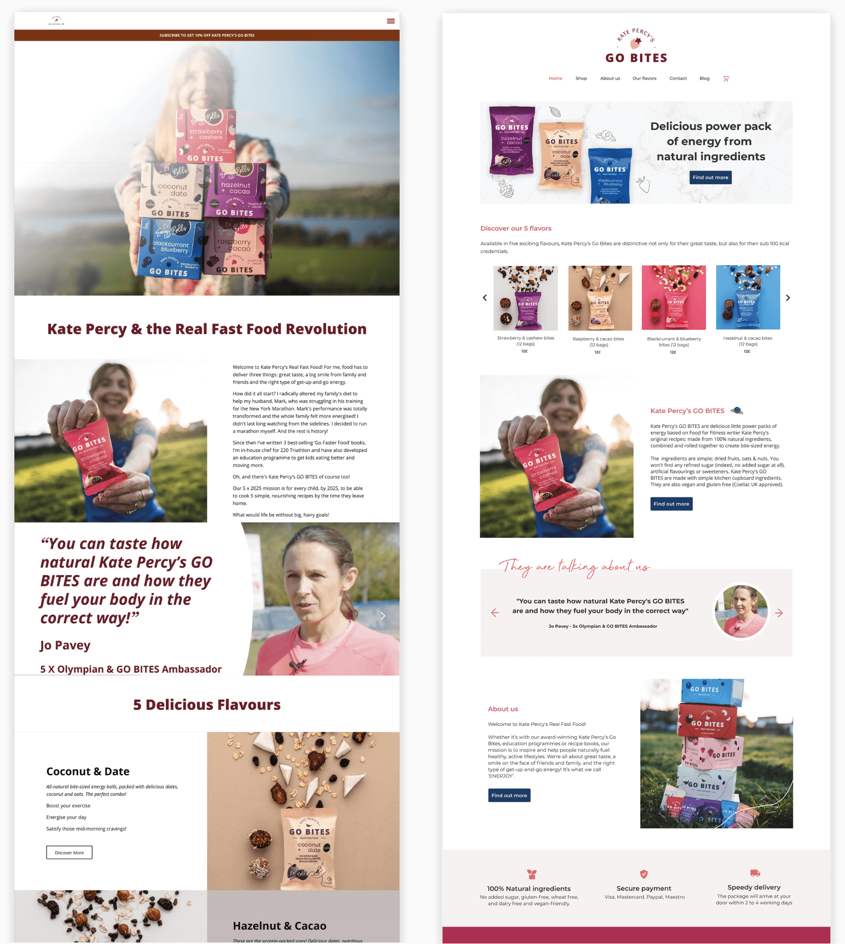
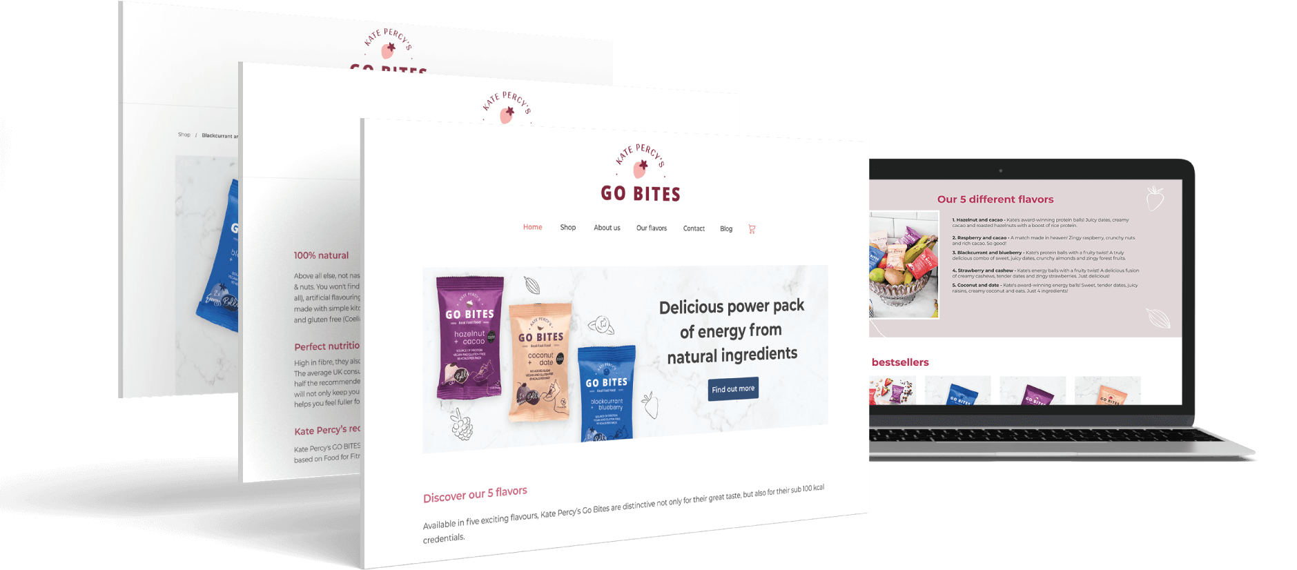
Home page
1. Intuitive navigation
2. Shopping cart highlighted
3. Above the fold optimised to pull user in with a banner showcasing:
– The products
– A headline
– A CTA

Smooth shopping experience
– Obvious shopping cart
– Familiar e-commerce looking feels
– Shocasing of the flavor, product, prices
– Explanation of the product and its benefits
– Link toward the shop
Highlight trust signals
Information about:
– The company
– The Ingredients used
– Delivery
– Payment
Footer with importants links and social media
Emotional triggers
– Product in context
– Smiling user
– Testimonials: Social proof

Before and After
About us
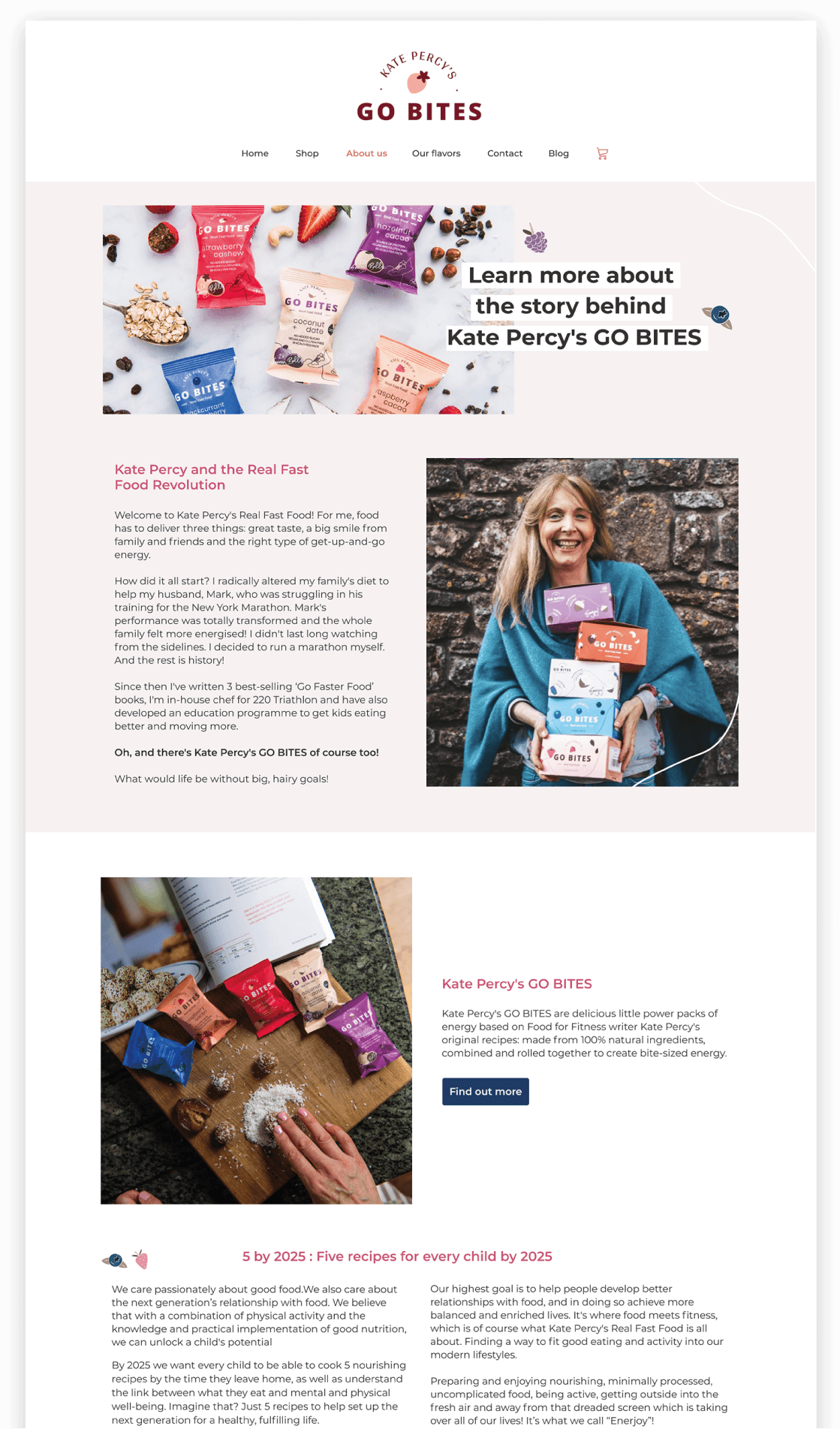
Increase trust![]() Authenticity and transparency
Authenticity and transparency
Authenticity of the company displayed in many ways
– Realistic photography
– Information about the creator (+ face smiling)
– Easy-to-understand headlines and texts
– Highlighting of community efforts
– Social media links (social proof + community feel)
Our bites
Focus on giving information needed by users and the conversion
– Key informations about the product
– Hero image
– Products in situation
– Bestsellers
– Social proof (testimonials)

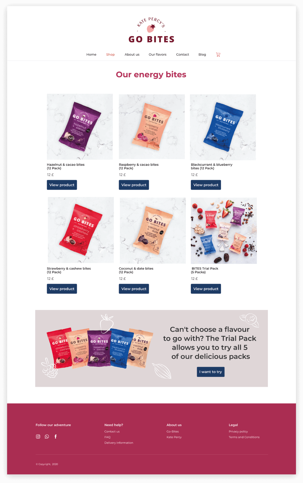
Shop
– Product grid
– New visuals to showcase the product
– Bundle choice :![]() For indecisive shopper
For indecisive shopper
– Animation when hoovering on the product :![]() The extra view may entice shoppers to click to the product page
The extra view may entice shoppers to click to the product page
Before

After

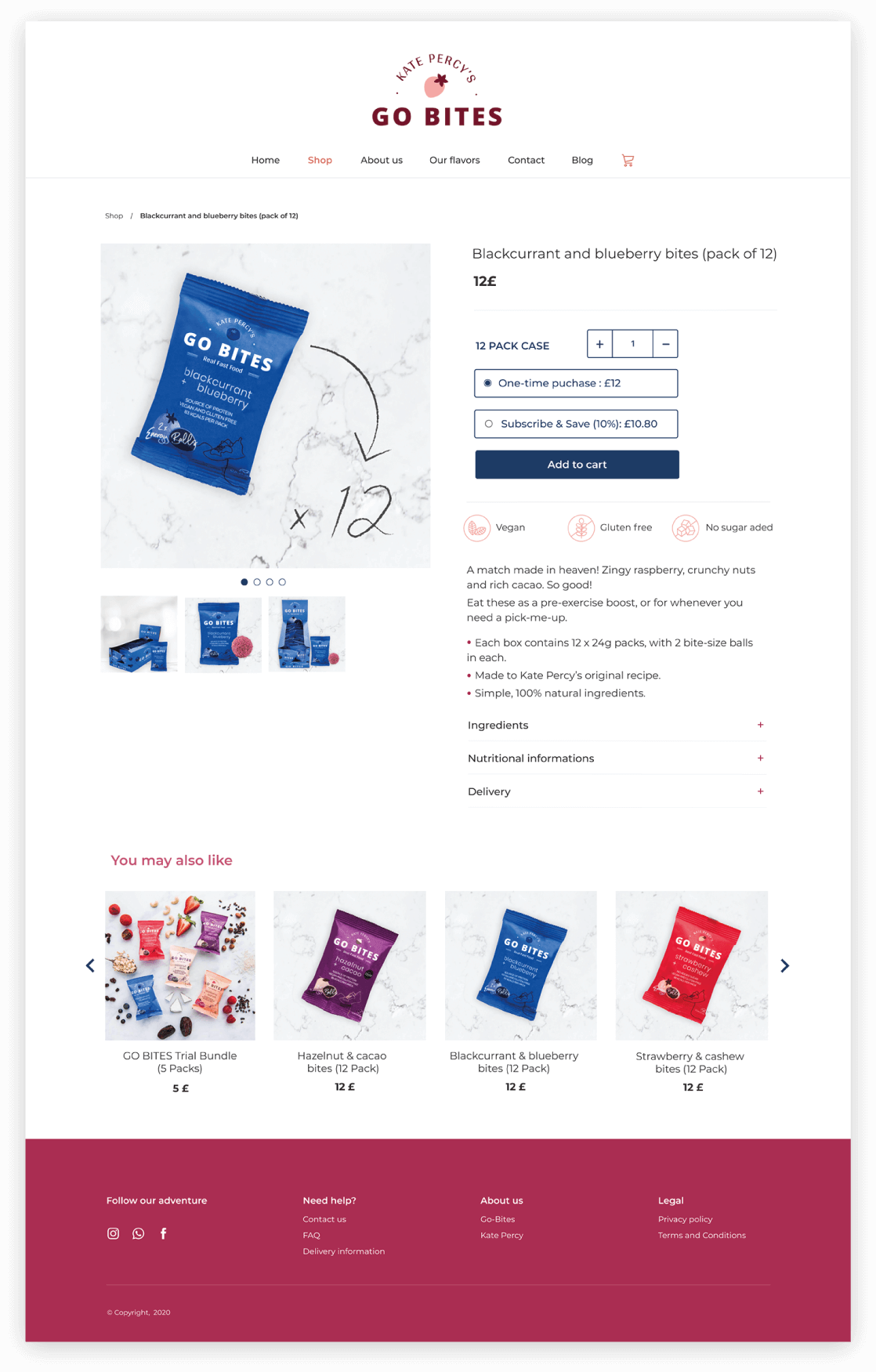
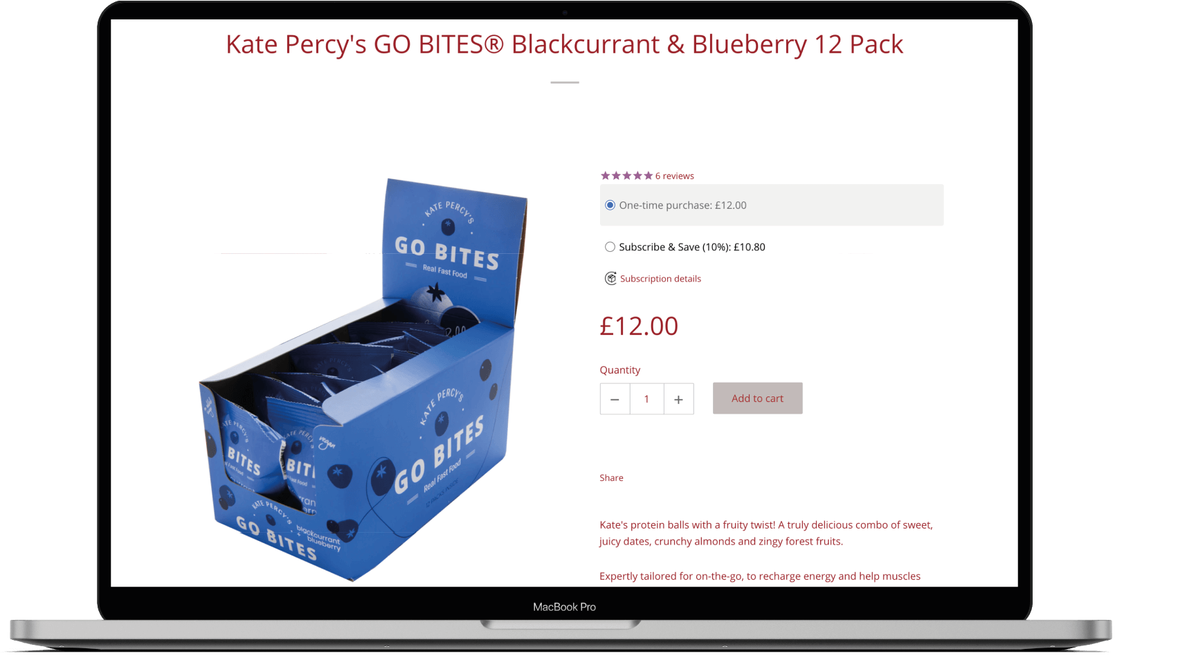
Product page
Determines if user will buy or not buy![]() User need to feel: Trust and control
User need to feel: Trust and control
Breadcrumb trail![]() Easy navigation
Easy navigation
Quality of visuals + every angle![]() Increase chance on conversion
Increase chance on conversion
Quality of visuals![]() Direct influence on the shoppers decision to purchase
Direct influence on the shoppers decision to purchase
Detailed product information![]() Dropdown to avoid too much scrolling
Dropdown to avoid too much scrolling
Before
After

Shopping cart
Easy and intuitive![]() Avoid shopper confusion
Avoid shopper confusion


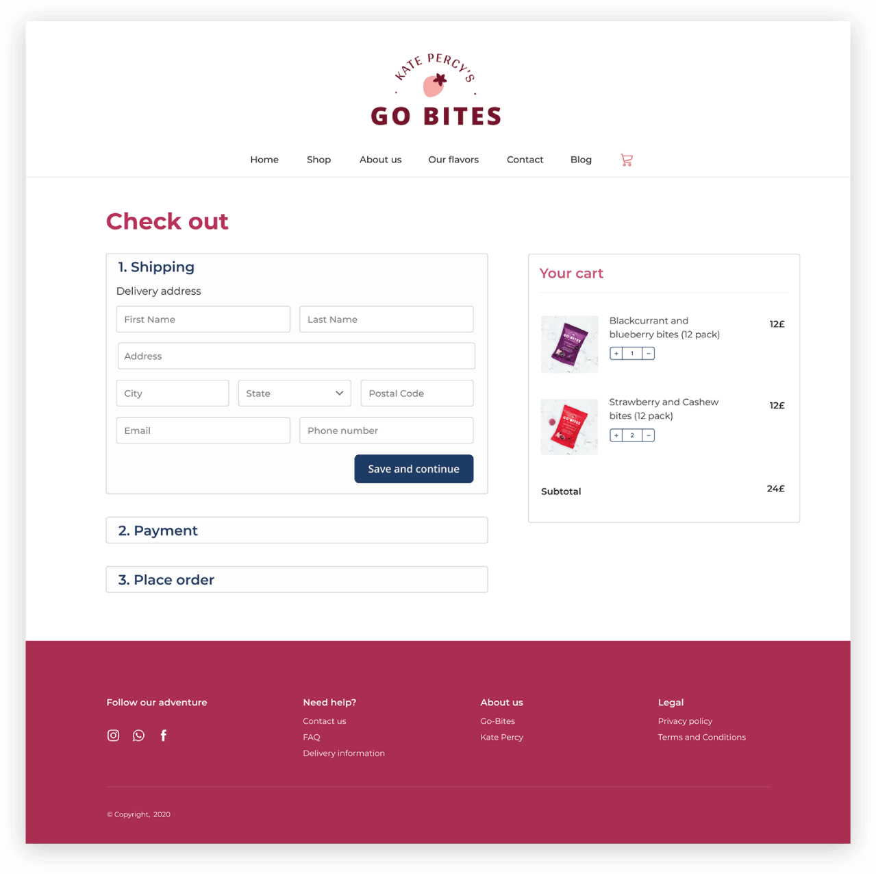
Checkout
– Smooth and simple process
– Minimum number of actions ![]() Short task flow.
Short task flow.
– Clear step by step process
Blog
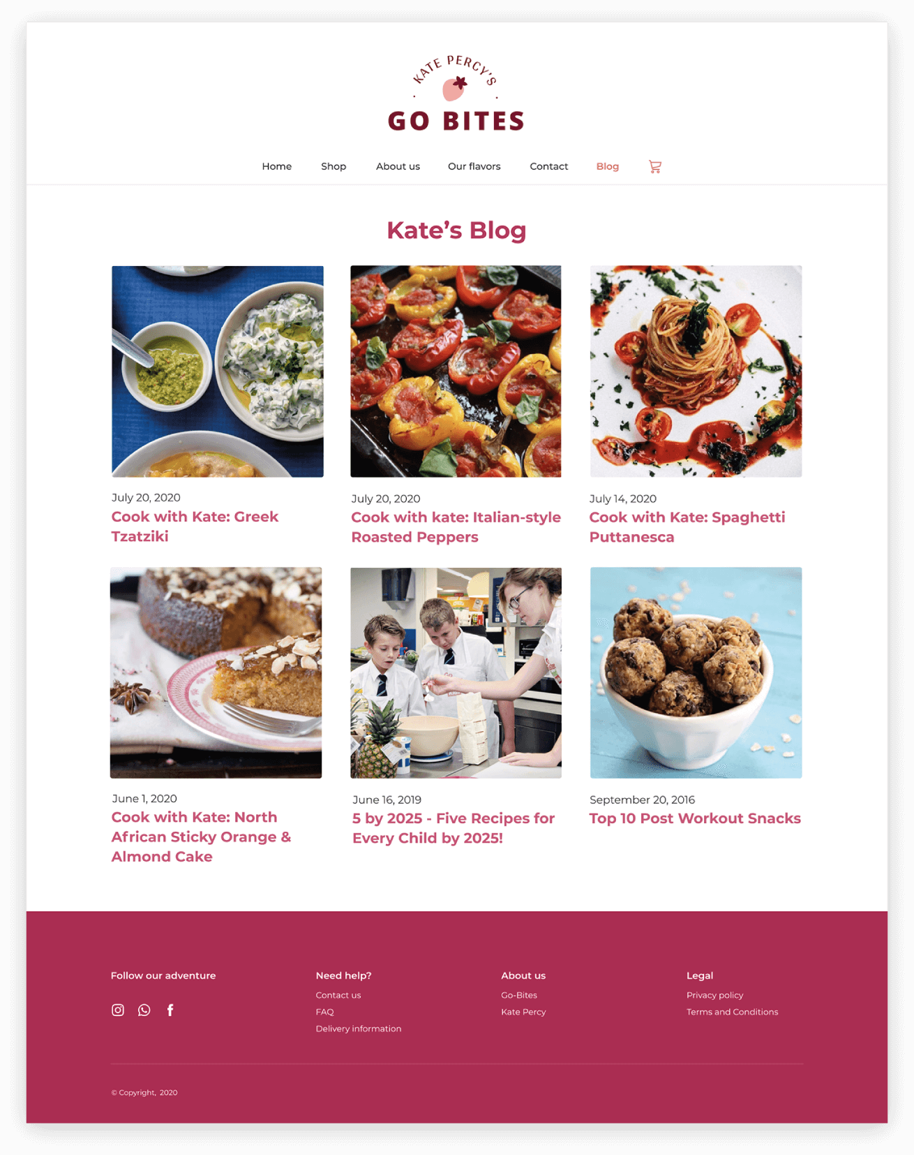
I combined cook with Kate and the blog![]() To simplify the navigation
To simplify the navigation
Contact page and FAQ
Help with trust and conversion


Style guide

Visuals

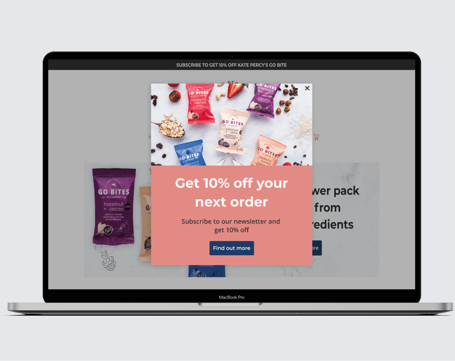
Next for the brand
– Copywriting
– SEO
– Photography: Product pictures in context
Thank you for reading this case
More projects


