UX/UI Case study : Lunettes de ZAC
THE BRAND
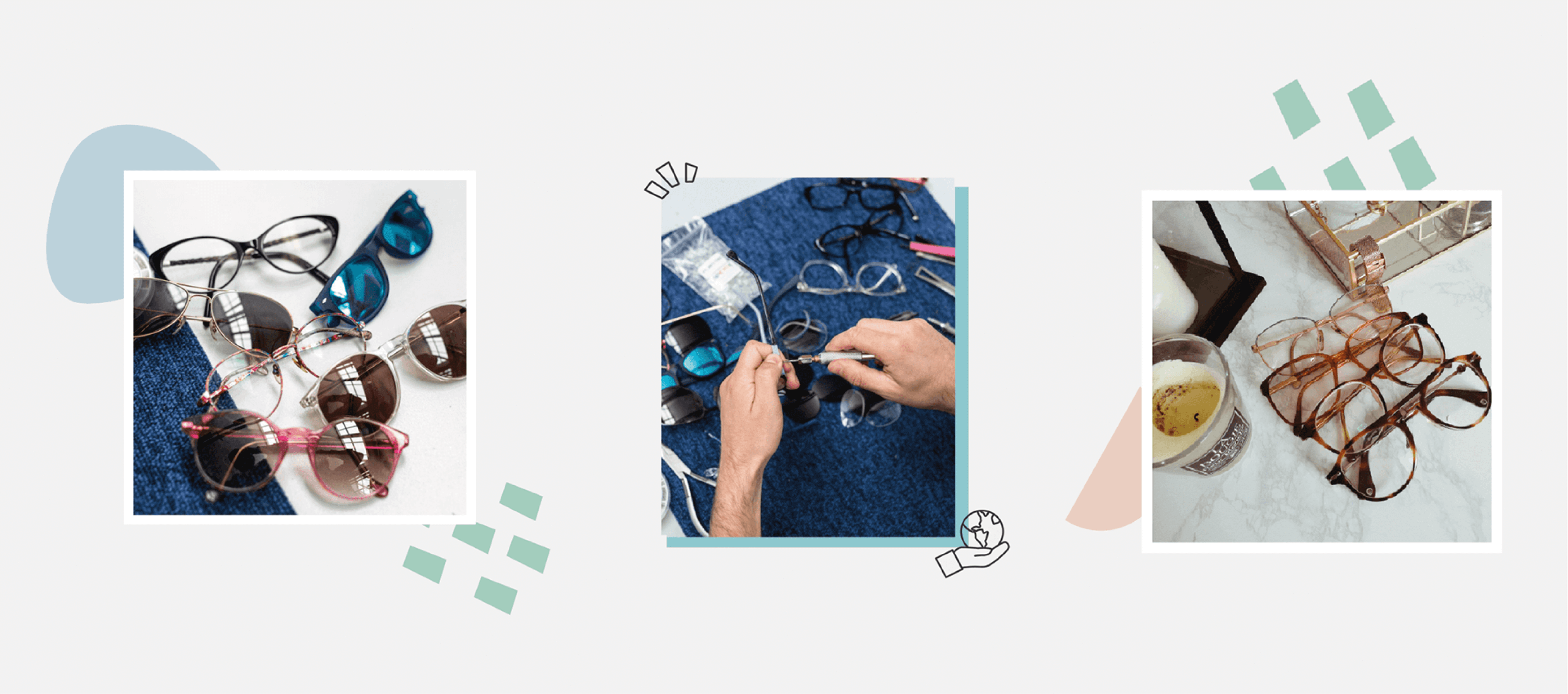
ZAC is a startup with a social and environmental impact that collect and recondition old glasses.
At ZAC, they fight against overconsumption in 3 steps:
1. Collect old glasses (with dropping boxes placed in common locations)
2. Recondition the old glasses
3. Put them back on the market, in-store or online.

MY ROLE
Ophélie, the founder and CEO of ZAC, contacted me with some goal in mind. She was launching the e-commerce website of Zac, and she needed a complete rebranding as well as a UI UX designer for the project.
I was impressed by the project as I quickly realize it was covering a real need.
The research Ophélie gave me highlighted that, in France, more than 100 million used glasses are left and forgotten in drawers. Those could be reconditioned and resold at prices more available to the public and consequently have an impact on the circular economy. It was a great project, and I was on board.
THE CHALLENGE
2. UI / UX design
After long talks and brainstorming, we identified the key features needed.
The website would be an e-commerce website, but it should also be used for informative purpose: Highlighting all the good action of the brand, showing users where to find the dropping boxes to drop their old glasses and showing users where to find opticians carrying the brand.
RESEARCH
PERSONAS
Thanks to that I was able to create 3 personas. Personas are a great way to simplify and they make the informations from the research easier to digest. It helps make a summary of things such as data, brainstorming, customer pain points and so on.
Primary personas


Secondary persona

WIREFRAME : CASE STUDY OF THE HOMEPAGE
I created the wireframe using a heuristic method and personas. It was a trial-error process, but after a lot of brainstorming with the team and some A/B testing, I came up with a solution. Here is the final wireframe of the homepage.

Composition of the homepage :
1. The header is really simple: The logo, a shopping cart icon and the few really important pages: Shop, Contact, and concept. The goal was to make it intentional and easy to navigate. It also shouldn’t also distract the user from the content of the different pages, mainly the homepage which is designed to directly suggest a flow to users according to their personas.
2. I wanted the homepage to be adapted to all type of users: The client searching for glasses (Ethical Esther and Student Stephen), the new user that don’t know anything about the brand (Ethical Esther, Student Stephen and Optician Olivier), and the optician who wants to join the adventure (Optician Olivier).
Consequently, arriving on the homepage, the first thing you would see would be 3 options: Contact, concept and Shop in little squares under the header.
The new user could learn more about the brand by clicking on the concept option, but could also be directed to the shop easily. The client searching for glasses could directly access the shop. The optician could quickly find ways to contact ZAC or learn more about the concept.
3. The “new items” part was implemented as to quickly show recurring users the new glasses. Also, it is a great sample of the products and a quick way to be attracted to an item and be directed to the shop.
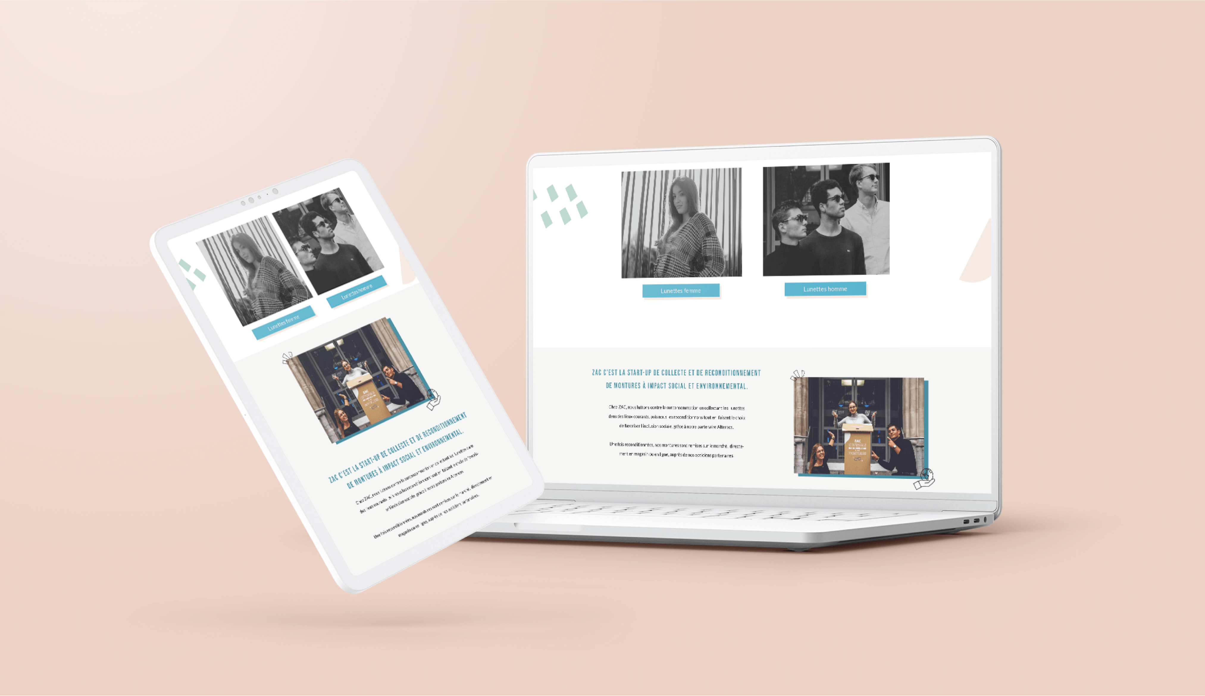
4. The next part is a quick way to be directed to the kind of glasses you are searching for: women or men, directing you again to the shop.
5. This part is a short presentation of the brand, which explain in a few lines what Zac is all about and maybe making users want to know more.
6. With that part, you could easily be directed to the map and find an optician carrying Zac’s glasses. It is also a quick reassurance to the user who prefers to try glasses on before buying a pair.
7. Next is an Instagram token, to show customers wearing glasses, as well as showing more of the brand universe and its young and cool feel. It is also a way to join the community and have updates on the brand.
8. For the footer, I placed all the elements that I defined as really important. As ZAC is focused on creating a community, you can also join the newsletter or find social media links.
Next to that, I implemented a menu with all the information about e-commerce like the terms and conditions and other useful information.
And I finished this menu with a link to the FAQ and the contact page. The FAQ is there to reassure the user. The team had already done a research to find the important question that needed to be featured.

VISUAL DESIGN
I made some different version for the visual part of the design.

After a brainstorming with the stakeholders and a lot of iteration we decided on the last one.

SITEMAP
For clarity and planning, I created a sitemap to quickly have an idea of every page I would need and how I would organize them on the website. It also helps to keep goals in track, and a great way to streamline your conversion funnel as you will have a high-level view of the project.

WORKING ON THE KEY FEATURES
E-commerce
I focused on the pain points of our personas to create the e-commerce experience of this website.
I made the checkout easy with only 2 steps/pages. I made sure the product pages had a lot of information.
I also took a lot of time to create a perfect page for the sizing guide, which I qualified as an important page involved in the decision making. Buying glasses online can be challenging as it is something you want to try, to be sure that it is adapted to your face and at the right size. With the information we kept on the page, it was really easy to pick a pair and be sure that it would fit you. Making this page visually pleasing and easy to read would help the user be less afraid to order online. For this reason, I focused on the aesthetic of this page and separated big chunks of texts with images and visual elements.

Highlighting all the good impact of the brand
The concept page was as challenging as the sizing guide page. It was really important to make big chunks of information digestible and fun to read. After dividing the information into paragraphs, I separated them with a fun fact in a quote, as well as adding the 3 values of ZAC that I illustrated with icons. I then used some visual elements to decorate the remaining texts, following the brand guideline.

Showing users where to find the dropping boxes to drop their old glasses and where to find opticians carrying the brand
For the possibility to find the different locations for the boxes and opticians, the idea we kept was to use a map.
The first page would give you the possibility to choose between the boxes and the optician.
You will then be presented with a page with a map and a list. By typing your location, it would show you the closest opticians or boxes near you.

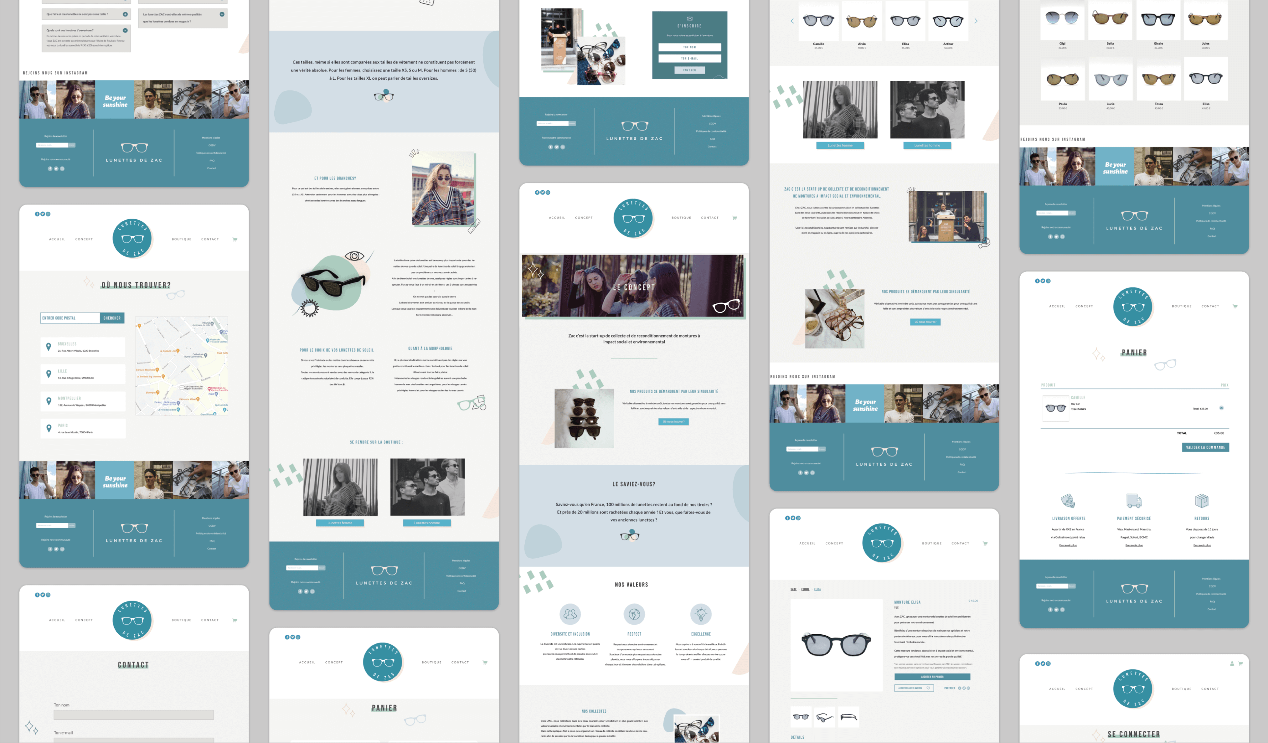
PROTOTYPES
After a lot of A/B testing, iterations and research: I did the final prototypes.
LOGOTYPE
I created a lot of different versions for the first sketch of the logo.

I wanted the logo to be simple, and the team and I finally decided on the clean and modern look of one of the round logos. I also knew that I wanted the logo to include glasses.

I also created sub-logos and elements so the brand could be easily used on every asset and channel possible.

BRANDING AND GUIDELINE


CONCLUSION
Designing this website was challenging and rewarding at the same time. Challenging because I had a tight deadline and a lot to do. But rewarding as the project was really exciting. I had no idea of the number of abandoned glasses, although it makes sense and I am certainly guilty of leaving my old one in a drawer. I loved the fact that this company did everything they could to have a positive impact on the world and I loved seeing the results of the design process.

THANK YOU SO MUCH FOR READING THIS CASE

